Our Work
Our process always starts the same, we get to know the people we work with, we listen and observe to help identify their needs.

INTELLITRACK PERSONA ANIMATION VIDEO. We call it the Bob Video
This collaboration involved several stages and we're so happy it's finally live. We met our end of the year deadline by 3 days!
Assignment: Create a company explainer video to be displayed on the Intellitrack home page.
Process: We met with the Marketing Manager of IntelliTrack to discuss the project. Christina has been working with the company for about a year, and has put a lot of work into re-branding; collaborating with sales to improve the customer experience and simplify its product offerings; redesigning and migrating the website; while also developing thought leadership pieces and expanding the brand assets based on the personas they developed earlier in the year.
Christina has her hands full, and we took some time to review the work she did and determined that while whiteboard videos were a fun trend, we wanted to use the personas her and her team developed to create a series of videos that would position her 5 personas at the center, as the hero. Plus, she had developed a lovely icon set that was perfectly in line with the brand, it was a great fit for this project.
So, we pulled out pencil and paper and started flushing out a script and storyboard. Recording the audio was the most fun for me. Reminds me of my audio production classes I took in graduate school. I would then bring those back to Greg to animate.
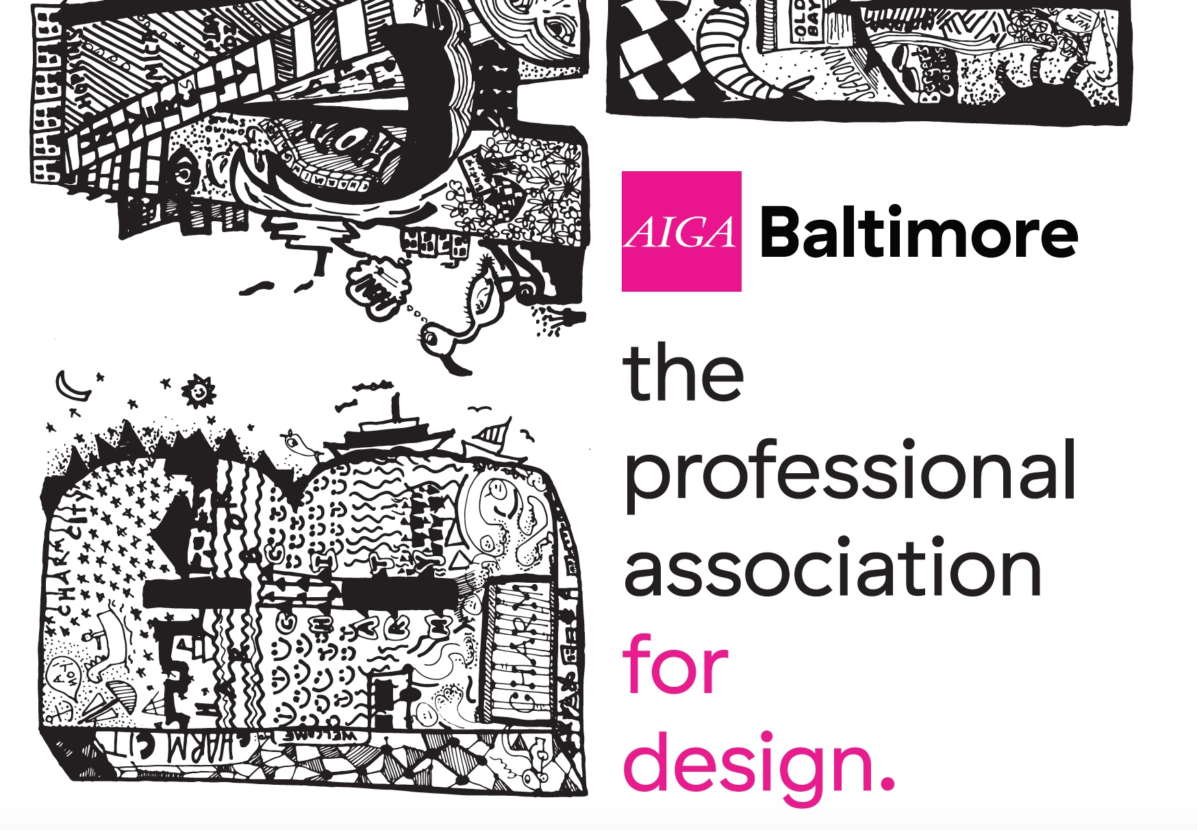
AIGA BALTIMORE, Banner Design and Community Engagement
I joined AIGA Baltimore as Education Director in 2013. My first task as a Design Week volunteer was to plan and execute Out of My Hands, a workshop designed and facilitated by Zvedzana Zvedava and Helen Armstrong, authors of the Participatory Design Book.
This fall 2017, I designed a banner as a tribute to my start with AIGA. Contributing my time to develop my leadership skills and connecting, collaborating, and educating designers to use their skills to positively impact their communities and industries has been incredibly rewarding.
These letters were co-created by those workshop participants, listed at the bottom of the banner (zoom in!).

Whitman Photography Branding
Crystal is a fabulous photographer and a great human. Working on this project was super fun, and we've found other ways to collaborate since we first met.
Becoming your client's client is probably the best way to truly understand someone's business and help them identify opportunities for growth. Our first project was designing her brand. We eventually started to meet and work on strategic ways to grow her business, from choosing the right online platforms to developing a marketing strategy.
Assignment: Develop a logo for Whitman Photography.
Process: I visited Crystal at her space, and asked her to put together a folder of the photography that best represents her work. It was clear from her work that she has two distinct styles, her wedding photography and her personal work, sprinkled in with corporate photography and portraiture, all reflecting her bold, high contrast vision.
We decided to develop a dual brand; two logos that would tie into each other, representing Crystal's artistic vision, but tailored to the appropriate audience. Crystal's work is bold with stark contrasts and required branding that was flexible enough to communicate her style, and attract the right clients.
The bat and the flora both possess similar qualities, yet are polar opposites. Watching Greg do this detailed intricate illustration was fascinating. Especially watching how he used the bat's outline as a guide to wrap the vine around the W. They are perfectly mirrored, creating a consistent look and feel, and yet able to stand independently from each other.
I'm excited to continue to work on this project, next up is the packaging design for the deliverables.